Help - your opinion needed! Comment and win result..
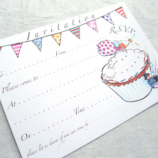
I need some opinions please... I'm designing some thankyou postcards to go with these invites... I was quite pleased with the first versions but then asked my husband and he felt the letters should be all tilting the same way.. and the fairy tipped up a bit. Now I am really confused! He may well be right *grits teeth*. Don't let that influence you!
Version 1:
Version 2:
Could you comment on what you genuinely think works the best please? I could scale up version 1 text wise or scale down version 2 text wise of course, just to confuse matters!:) Any suggestions would be much appreciated.
Here's the boys' version 1:
and second version:
As a thank you for your time I will choose one of you at random to win a prize in the form of a pack of 8 of the final thank yous - either boy version, girl version or half and half - whichever you prefer.
Fire away! Hope some of you want to help. Ends Monday 12pm just so I am forced to make a decision and get on with them! x Gabs
The competition is now over and the winner has just been announced - thank you all very much for your comments.


I prefer version 1 :-). The ou looks a little lonely on version 2. Hope this helps? :-/ x
ReplyDeleteVersion 2 for me.
ReplyDeleteThanks both, have had a "version 1" on Twitter.
ReplyDeletePlease keep the comments coming!
Definitely version 1 for me.. the letters look far more 'together'...sorry Mr. Moobaacluck! :)x
ReplyDeleteI like version 1 the best in both cases. I like the way the fairy is writing the words. The letters all sloping the same way only really works when they are in a straight line. if they are scattered, a uniform slope doesn't make sense! (IMO)
ReplyDeleteI Prefer version one but prefer the fairy tilting up in version 2 to complicate matters :)
ReplyDeleteVersion 1 writing is much more readable so like these ones best, although the Fairy does look like it should be a bit more on the slant like version 2 x
ReplyDeleteHi Gabs, can't comment on blog but Love the lettering on No 1 but with fairy tilted up as in No 2. Boys: Love number 1. HTH x
ReplyDeleteKatie Levett ( I am posting for her!)
Liking the idea of 1 with more tilted up fairy...
ReplyDeleteWhat about the boys' one?
I definately prefer version 1 for both. Version 1 flows (and reads) better and I like the way the fairy is finishing off the "u". :)
ReplyDeleteMaybe the fairy could be mirror imaged so she is at the end of the "u" ? x
ReplyDeletebrilliant Kim! x will try that x
ReplyDeleteI agree with most other people about lettering of No1 with tilted fairy of No2.
ReplyDeleteAs far as the boy version goes, I wonder if the T is getting a bit lost because of the little pirate leaning against so much of it? But otherwise i prefer version 1 :)
Gabs (also!) x
Couldn't get my comment to send via your link?! Anyway def version 1 for girls. In which case I assume you would want to use version 1 boys, in which case I think the 'n' could shift round clockwise a little... Hope this helps! Cx
ReplyDelete( posting for Cath - not sure why some people can't comment - these things are a mystery to me and most people I think!)
My immediate thought was that I prefer the lettering in version 1 and the fairy from No 2 and now I find I'm not the only one! I also prefer the boys version 1 too!
ReplyDeleteVersion 1 in both cases for me, and yes I too like the fairy from version 2. xxx
ReplyDeleteDefinitely version 1 - looks better as it's more "together" - in both cases :)
ReplyDeleteDef. version 1 for me too- I personally think its much more visually engaging with all the letters going in different directions :)
ReplyDeleteDefinately prefer the fairy flying up in version 2 as she looks like her balance has gone in the 1st one, but I prefer the smaller lettering of version 1. Boys one version 1 works for me.
ReplyDeleteX
Hi I prefer version 1 of the girls and version 2 of the boys. I found it difficult to follow the text on the other versions.
ReplyDeleteAnd artist husband says version 1 for the girls but with the angle of the graphic (angel) changed to that of version 2 as it interferes with the text and version 2 of the boys
I hope that helps x
Hi,
ReplyDeletedid this with my boyf.
We disagreed on both. I like both version 1's whereas he likes both version 2's. I could read the version 1's easier and he said the same about version 2's.
So WE agreed that version 1 was the best! :-)
After careful consideration I like version one for both, hope this helps :)
ReplyDeleteBee happy x
Have a delicious day!