Busy designing

I've been taking part in the thought provoking Branding Masterclass run by Flourishstudios.co.uk
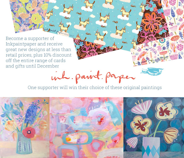
This is my mood board for what will be GabriellaBuckingham.com
After a week or so of doing the course it dawned on me that I need to demarcate what I do - the opposite of what I did two years ago when I tried to show all my skills under one site! Which is probably why I have been fighting this mentally for so long.
Rather than forcing things into Moobaacluck that confuse and cloud what Moobaacluck is (to most people it represents a children's line - which is fine) I want to do more while building on Moobaacluck's strengths.
So I've been playing about with a holding page for this new site while I design a stationery range. As you do.


I don't want to get too hung up on how the holding page looks as the background to the actual site will be white... I will be interested to know what Fiona at Flourish and fellow class mates think of these options.
The middle one is probably too romantic and summery. . . but I enjoyed sketching the honeysuckle and learning how to tint a sketch and underlay behind the type - what a relief! ( ref. to the surfacepattern ecourse that I am taking concurrently)
My favourite has to be the top one. The bottom one reminds me of James Bond... the credits at the beginning ... or holiday destinations. Can't be right.
What do you think?

Hi Gabriella, I like the middle one. I agree it is quite romantic but it also feels fresh and new and quite contemporary. Tina
ReplyDeleteMiddle one for me as well Gabs. The other two are too busy for the eye in my opinion. I found my eyes roving all over the place taking in different bits of information. It also intrigues as to what might be coming soon. Stupidly I thought it was a firework explosion in the back which went with the words, but I still really like the honeysuckle just as much. Hope my thoughts help some.
ReplyDeleteX
I agree, the middle one does it for me. So looking forward to seeing your stationery range - I'm a real stationery nut!
ReplyDeleteJoy xx
I love the top one. It's lovely and clean which gives me a chance to think about where you might be going with the stationary, print and design.
ReplyDeleteI like the middle one... BUT I also think the top one is more connected with your work.
ReplyDeleteThe middle one says 'perfume and lace' to me, so unless you're branching out into beautiful, quirky, fun undies, I'm with you and go for the top one.
Celia
x
Yes, the middle one does it for me too but if you dont like it then I agree that the top is better than the bottom one. :-)
ReplyDeleteTop one for me! I do like the middle one but it's a bit too girly and lacy as Celia said. The colours are fab and I can't wait to see what you're up to. The Branding Masterclass has been fantastic and we're only half way through. It's incredibly thought provoking and taken me on a giant roller coaster ride that I had not expected! But it's brilliant and I know you are also getting loads out of it. Exciting times ahead I feel ;)
ReplyDeleteLove the top one. The colours have energy, and the design lets your logo sing. Looks beautiful!
ReplyDeleteThe middle one is stunning, but I'm not sure it's very 'you' ;-)
Oooops meant that it's too subdued to be you. Not that you shouldn't be stunning ;-)
ReplyDeleteLOL Fiona !! :))) x
ReplyDeleteThanks for all your comments; I am going to stick with my original thoughts and totally agree that if I were going to be selling perfume, cosmetics or weddings then the middle one would be best.
ReplyDeleteBut I am very much at the development stage of this new range and I don't want to pigeon hole my approach..
You've helped a lot!
Hello :)
ReplyDeleteI totally agree with the comments that the top one reflects you and your work more. Its lovely by the way & a gorgeous colour!
Really love the middle one but again I'd only pick this one if you started selling new products and need a variation in your branding.
xx